UX Modeling Tips
On this page we’ll run through some handy modeling tips to get the best results from UI wireframing with Enterprise Architect (EA) and CodeBot. These tips are based on common wireframing mistakes that we’ve seen people make. We’ve also made the exact same mistakes ourselves, so consider this a “lessons learned” page!
Make the wireframe shape resemble the shape of the page you’re designing
That is to say, don’t necessarily assume that the page has a particular shape - it’s headed for a resizable web browser, after all, and users can stretch and resize their browser windows to any shape or size they like (as long as it’s basically a rectangle, of course).
However, it still pays to start off with wireframe dimensions that resemble the page layout you have in mind.
There’s a tendency for people to start with a wireframe along these lines:
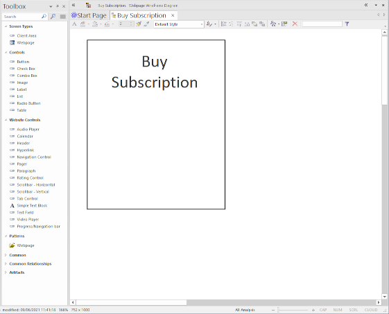
The trouble is, as more items are added, space gets “scrunched up” quite quickly, and the dimensions work against creating a page layout that has room to breathe.
Instead, start with a more zoomed-out overview - literally, zoom out of the wireframe - and start with something like this:
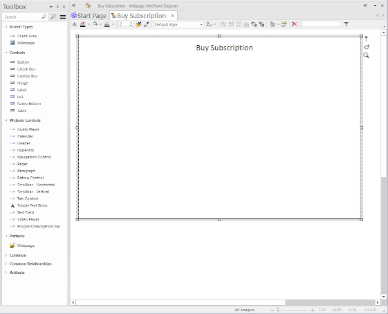
Use Ctrl+scroll-wheel to zoom in or out of the wireframe.
This sort of “bird’s-eye view” allows you to add containers and components without having to constantly rearrange and resize things to make room…
… which leads neatly to the next tip:
Begin with empty containers to get a feel for the overall layout
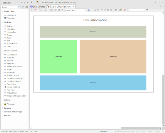
In fact, use containers prodigiously to define the overall page structure and layout.
In UX design, there’s the “mobile first” school of thought - which, to be honest, every UX designer should follow. The idea is to start by designing the page for mobile, then “building out” from there to make sure the layout also works well on desktop browsers and applications.
However, here we’re more looking at an expansive desktop layout first. We can trust that react-bootstrap (which CodeBot UX targets for web-apps) uses responsive layouts, so - in the above example - containers will resize and “flow” down to the next row depending on the available real-estate.
Run CodeBot early on, and keep generating incrementally
This also helps with the previous tip… because it’s relatively quick to run CodeBot and try out the actual generated page in a web browser, you can quickly see how the page design is shaping up.
Use Chrome or Firefox’s Developer Tools to see how the page will look on mobile, ipads etc.
Name all your components, including containers
Using EA, the default component names reflect the component type - Combobox, ClientArea (container/panel) etc. This doesn’t cause a problem as such, but CodeBot does use these names in the generated React and Redux code:
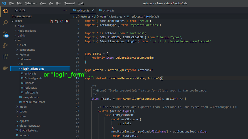
Of course, this won’t affect the visible page at all, but for overall clarity and “good form” you might still want to rename the components based on their domain-driven role. For example - as in the above screenshot - rename a login Client Area to “Login Form”. This can really help when you’re customising page styles or exploring/reusing the generated code - it’s easier to find a container called “Login Form” than the fifteenth “Client Area”!
Don’t worry about whether to use
snake_case,CamelCaseetc in the model names - always just use “Natural language” naming, i.e. “Login Form” instead of “login_form”. It’s more pleasant to work with, especially as the model is positioned at the “business domain” level rather then the solution-space or implementation level. When CodeBot runs, it’ll “case” the names appropriately depending on what’s being generated.
Naming all the components helps to keep the model and MBSE process entirely within the context of the business domain. This “pays dividends” further down the road, as the generated system is integrated with other systems, as more complexity and new features are added, etc.
Make the wireframe closely resemble the generated page
This one might sound a bit reversed; but the idea is that you style the generated page with custom CSS - in effect, this is applied after the code is generated and the application is built. This can result in wireframes that - in terms of styling, at least - don’t completely resemble the page being generated. So, from a UI design perspective, it makes sense to at least keep the wireframe appearance matching the target styling.
For example:
Page headings and subheadings
To define a heading, you create a normal Label, then add a css class tag with the value h1 (or h2, h3, … etc).
However, left as-is, the “heading” label in the wireframe just won’t look like a heading:
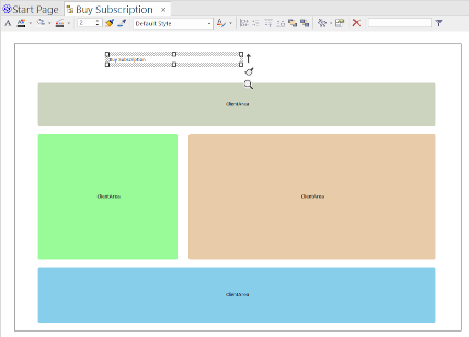
So you’ll ideally want to adjust the label size in the wireframe to a more suitable “heading-like” size.
Based on the default Calibri font, we recommend standardising on 18pt size for h1, 14pt for h2, and so on down.
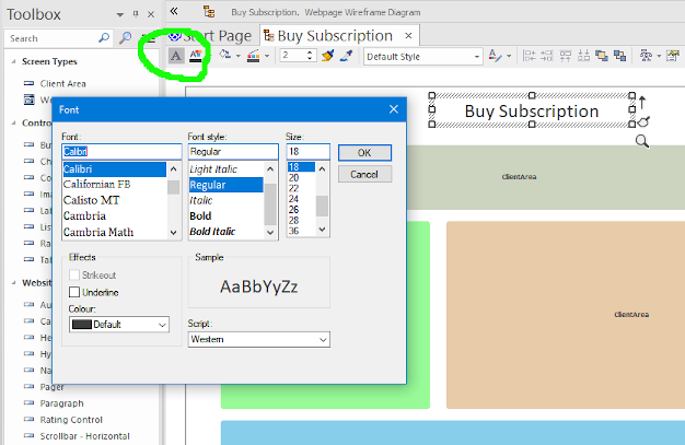
As headings are usually centred and can word-wrap, it’s worth making sure the wireframe headings do likewise:
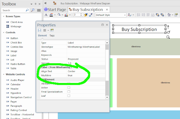
This also allows the heading component to be positioned more “sensibly” on the wireframe, e.g. if it’s made full-width, the text is still centred.
Customising the wireframe appearance some more
In EA, you can further customise the appearance of components as follows:
- Make sure the diagram isn’t in “whiteboard mode” or using some other global style/theme - right-click on the diagram, choose
Properties, and make sureWhiteboard Modeis unchecked. - Right-click on a component and choose
Appearance > Enable custom draw style. - Use the style toolbar at the top of the diagram to change the component’s appearance.
To set the background colour on a container, you may need to set both the “fill” colours to the exact same colour.
Uncheck ‘Make all elements dockable’
Doing this will make EA’s wireframe editor much easier to work with, especially when zoomed in or out, or with “Enable custom draw style” switched on.
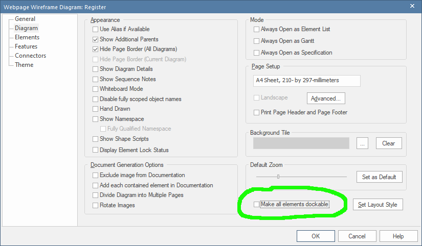
Right-click on an empty part of the diagram and choose Properties. The checkbox is at the lower-right, in the Diagram tab.
Make frequent use of EA’s ‘alignment’ tools
When you’re drawing a wireframe, be sure to follow UI design “best practices” and keep elements aligned. EA’s alignment tools are a real help for this… once you start using them, you should find you just “naturally” use them almost unconsciously to keep everything consistent and lined up:
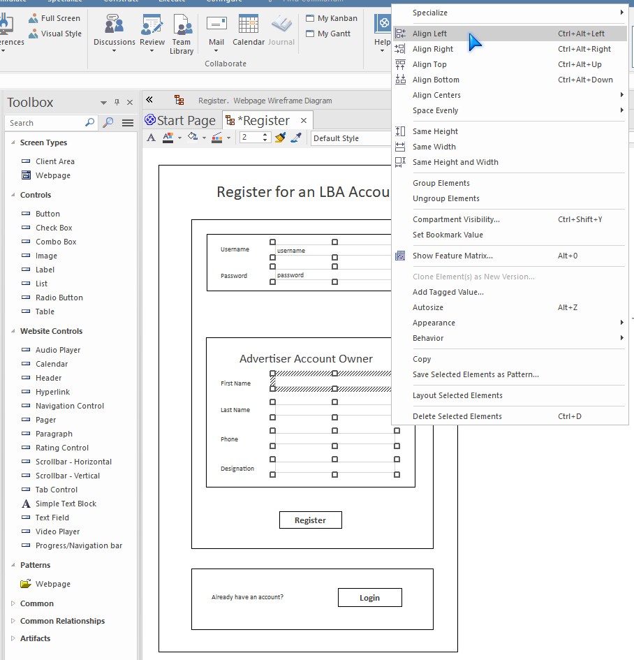
For example, textfields can be left-aligned together, made the same height and width, etc. To use, Ctrl+Click the components you want to align, then right-click on one of them, and choose from Align Left, Align Right, Same Height and Width etc. The other components will be aligned or resized to match the component you right-clicked on.
If you find the change wasn’t what you wanted (e.g.
Align Centerswas horizontal instead of vertical), a quick Undo (Ctrl+Z) gets you out of trouble. So feel free to experiment!
While we’re at it, learning the keyboard shortcuts (e.g. Ctrl+Alt+Left to align left) will make the process even quicker and more of an “unconscious act” while you’re designing the layout.
To perfectly centre-align a component inside its container:
- Ctrl-Click both the component and its container
- Right-click the container, then choose
Align Centers > Align Vertically
Generally, the alignment won’t necessarily affect the generated pages/screens, as CodeBot translates the “x,y” positioning on the wireframe into a grid layout, which will be naturally aligned. However, certain things do have an effect on the generated layout, e.g. component height and width; also a wireframe that “looks right” helps to get people thinking along the right lines, in terms of good UI design.