Styling your application
With any UI, it’s important to be able to style it so that, for example, it matches your company’s own branding (right down to fonts and font sizes, colours, spacing etc). In this page we explore how you can achieve that with CodeBot UX.
Use tagged values to specify CSS classes
Each wireframe component can be given tagged values, which CodeBot then interprets when it’s generating the code. To specify a CSS class, use a tagged value called css class.
You can add any number of CSS classes, either separated by spaces like this:
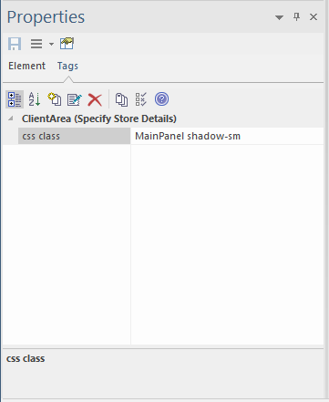
or as separate tags, like this:
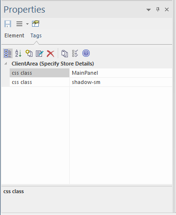
Bootstrap CSS classes
CodeBot generates React.js pages; more specifically, it generates React Bootstrap. So the components can all be styled using “standard” Bootstrap CSS classes.
Bootstrap includes CSS classes and style variants for headings, buttons, alerts etc; in fact for all component types.
So (as you saw on the previous page) you can turn a label into a heading by
CodeBot provides some additional styling in a default stylesheet, which you can find in the generated app as index.css.
When we add support for additional target platforms such as Flutter (for desktop/mobile apps), we’ll include an automatic mapping from the Bootstrap class and variant names to the target platform styles, so the wireframes shouldn’t need to be modified at all.
Defining headings
You can define headings and subheadings in 2 ways: as a CSS class, or simply by defining the font size. (We recommend that you define the font size even if you define a CSS heading class, so that the wireframe resembles the generated page as closely as possible).
Heading components are no different from other text labels; they’re just styled differently. So to create a heading:
- Drag a Label component onto the wireframe
- On the Properties panel, switch to the Tags tab, and enter a tagged value called
css class, with any of these values,h1,h2,h3,h4,h5,h6 - Make the font size big enough to look like a heading, or sub-heading. We recommend size 18 for
h1headings, and 14 forh2.
The following screenshot shows all of these styling elements:
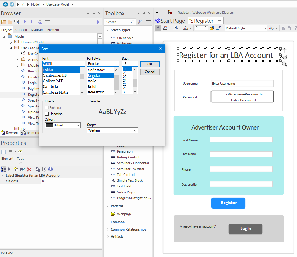
To access the label font, click the A icon on the toolbar above the wireframe. And to enter the tagged value, find the Tags tab on the Properties panel. This is on the right in EA’s default layout.
Style variants
Bootstrap defines a standard set of style variants - primary, secondary, success etc, which CodeBot also supports. You can apply these to any component, such as a button or panel, using the variant tagged value:
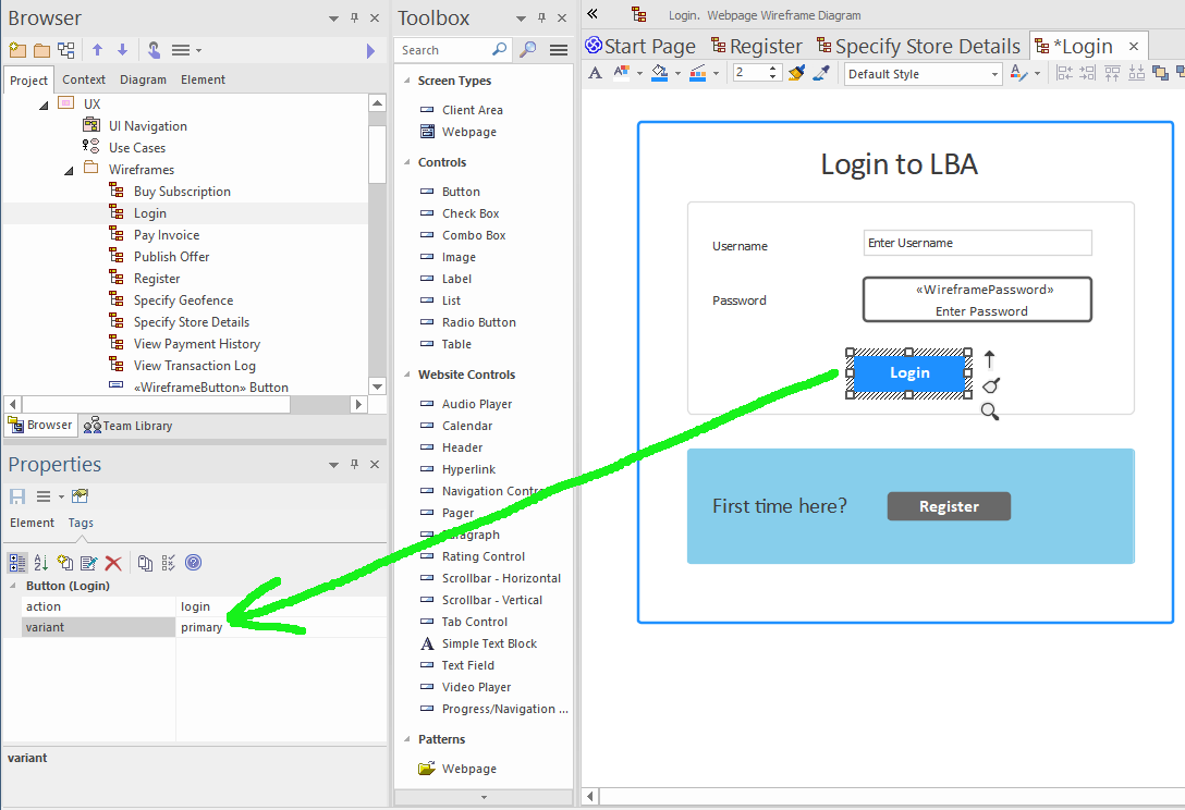
If a variant tag is applied to a Client Area/Panel, CodeBot will generate it as a React “alert” panel.
The eight variants are:
- primary
- secondary
- success
- danger
- warning
- info
- light
- dark
Using these variants allows your UI to adhere to Bootstrap’s recognised design language - if a button is the “main” action on the form (“Ok” or “Submit”), use primary; show secondary actions (“Cancel” or “Back”) as secondary; show success alerts as success, etc.
Using custom stylesheets
It’s possible to include custom stylesheets in your wireframes. You can either put all your styles in a single “global” CSS file that will be shared by all the generated pages; or define a separate stylesheet for each page. Or use a combination of the two, with a global stylesheet containing shared styles, and specific styles local to an individual page.
The process for including custom stylesheets is very similar to the process for including images. As with images, there are 2 possible methods:
- Embed an
Artifactin the model - Use tagged values to download a stylesheet from the web
Embed a custom stylesheet as an Artifact in the model
In EA, the easiest way to do this is to drag your CSS file straight into the model. Currently you need to drag the file onto a diagram. However, once you’ve done this, we recommend deleting it from the diagram - you can still find the new asset in the Project Browser. It’s also worth keeping all custom assets together in one subpackage, beneath the Wireframes package, so that they can be located more easily.
Having done the above, the CSS file will be included in the generated React app, under /public/resources/.
CSS Modules
As with other web toolkits or frameworks, React allows you to limit the scope of a CSS file to a specific component or module. The convention React uses is to name the scope-limited CSS file something.module.css instead of just something.css.
CodeBot uses the same convention - and will attempt to match the same convention for any future UI platforms it supports.
To match a module CSS file up with the correct “page” component, drag the file asset onto the associated wireframe.
Specify external stylesheets using tagged values
This only works for global stylesheets (i.e. those that are imported for the whole web-app).
To include an external stylesheet, you need to place the CSS file somewhere that CodeBot will be able to download it from. You then specify the stylesheet URL using a tagged value called stylesheet url. Place this on the “outer” panel of the wireframe:
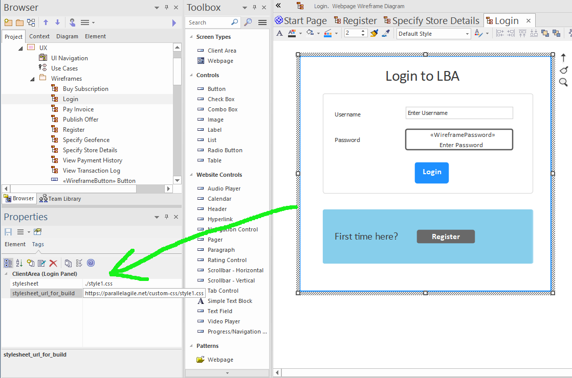
CodeBot will use the filename portion of the URL for the downloaded filename, or will choose a filename if one can’t be “obviously” derived from the URL.
If you want to override the filename, add a second tagged value called stylesheet name. This should simply contain your preferred filename for the custom stylesheet.
The stylesheet URL in the above screenshot is: https://parallelagile.net/custom-css/style1.css. It applies some light additional styling to each page, to illustrate how the generated page styles can be customised.
The above 2 tagged values only need to be specified once in the whole application, i.e. to be used globally, the tags only have to appear on one wireframe. The CSS styles are then available in every page. As a convention, we recommend adding stylesheet URLs to the main landing page (i.e. the page/state that the Initial pseudostate points to), so that the URLs can be found easily later on.